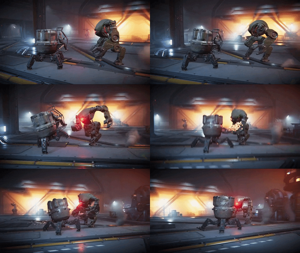
In an ideal world, game developers would have all the time and resources to make the game of their dreams. We’d all be creating our games from our seaside villas while drinking frozen margaritas and hiring a pro to make the trailers for their game. Sadly, that’s not the case. We’re well aware that most indie developers cannot afford such luxuries. Here are some tips on how to make a good trailer for your game without the need of an editing pro!
1. Make a list of the coolest looking things you want to show off in your game. These should also include your game’s hooks and USPs (Unique Selling Points). These are the things about your game that attract players and set your game apart from other games.
2. Pick some good music. Go through your list and try to imagine how each of your items would look while that song is playing. This is very important as you will have to fit your scenes to be in sync with the music for the best possible result.
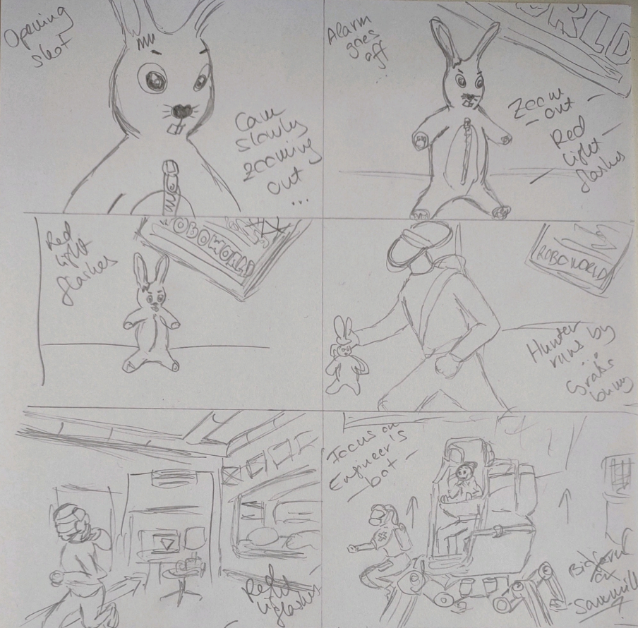
3. Draw a storyboard. Even if you’re only making a gameplay trailer without a plotline you should have a story arc that draws viewers in and makes them keep watching your trailer. You may want to check out the videos of trailer-wizard Derek Lieu who has great advice on this!
The first shots are crucial. You have 2-3 seconds to hook the audience before they lose interest and scurry to another YouTube video. Make sure to show something very eye-catching that peaks interest as early as possible in the video!
Keep in mind: you don’t have to be an artist to draw a storyboard. Here’s a couple of shots from the storyboard I’ve made as an example (note: the yellow thing is a robot puppy from our game, not a deer suffering from jaundice).
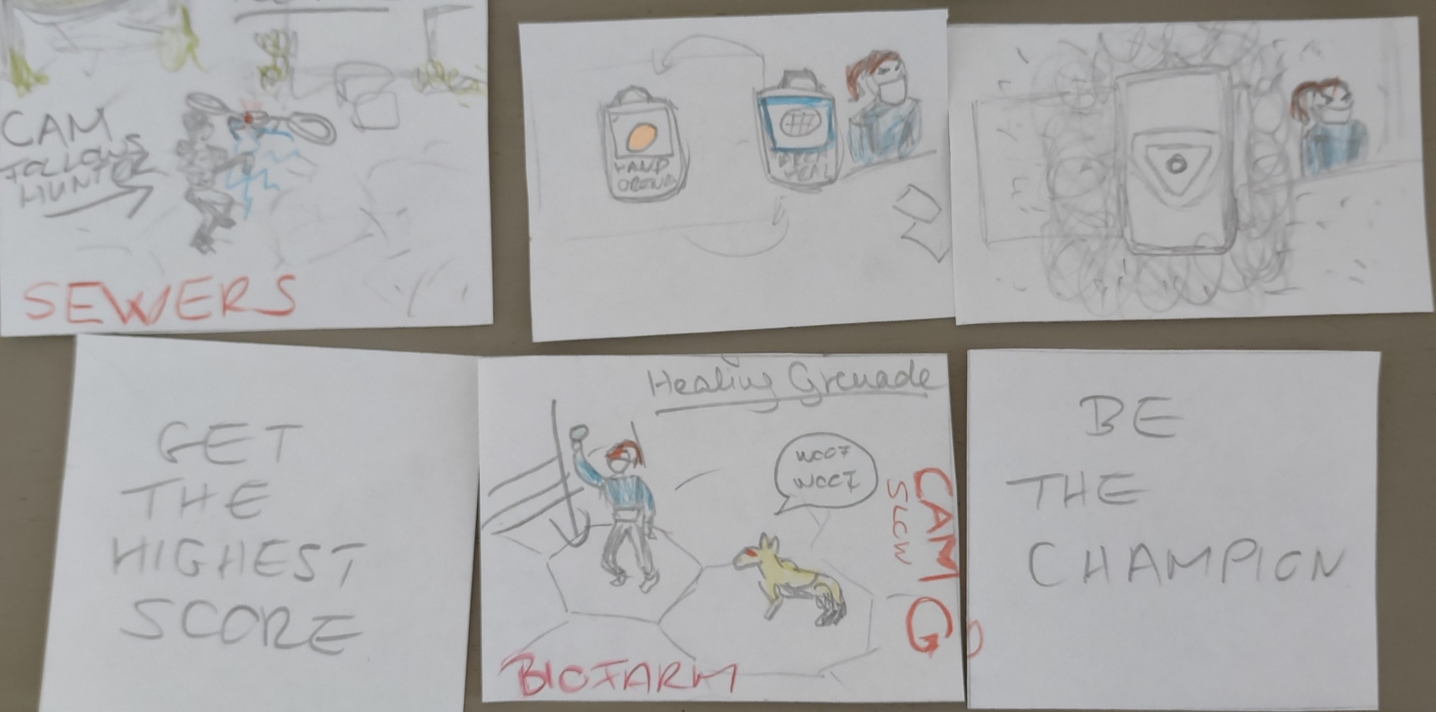
Even if they look like a 5 year old’s artwork made in kindergarten, storyboards are very important. They help you place your individual shots in the best possible order and imagine how the whole thing will look once it’s ready. You should avoid placing shots with the same colouring after one another – this can end up making your trailer a bit monotonous and, well, boring. Make sure to have a good variety in there, and alternate between very quick, action-packed shots and some slower, longer ones that can help build the tension.
Don’t show all your cards! Your trailer should share just enough to get viewers curious and make them want to play your game. So remember not to share everything, keep some for the people who buy your game and avoid spoilers that are important to the story!
Our Cinematic Teaser Trailer, BEFORE…
…and AFTER
4. Record some gameplay/create the cinematics from your storyboard with the engine you use. This is a pretty complex one that I could write long, long articles about. But for now, I’ll leave you with some key takeaways we’ve learnt from experience:
– If you record gameplay, make sure to have some camera movement in it (if possible). It will make the scene more interesting and eye-catching. For example:

– Gameplay is very important! Even if you’re making a cinematic trailer, you should have at least one or two scenes that show viewers what to expect if they buy your game.
– If you’re making a gameplay trailer, make sure to show some of the user interface in there. In case of a cinematic or story trailer, gameplay shots without the UI can look more appealing and more professional so make sure to have a way to disable it in the game.
– Make sure you’re recording the gameplay with the graphics set to highest quality and at 60 fps.
Check out some more tips from, again, Derek Lieu here: Trailer Made: What Makes a Successful and Memorable Game Trailer.
5. Let’s get down to business: the editing part. You can find a number of free video editing tools online but we would recommend using a good one, even if it’s pricier. These will give you a lot more options and cool effects to work with, and most importantly, won’t put a watermark on the video you export. Make sure to put enough time in this, because bad editing can make your trailer look very sloppy and turn potential buyers away.
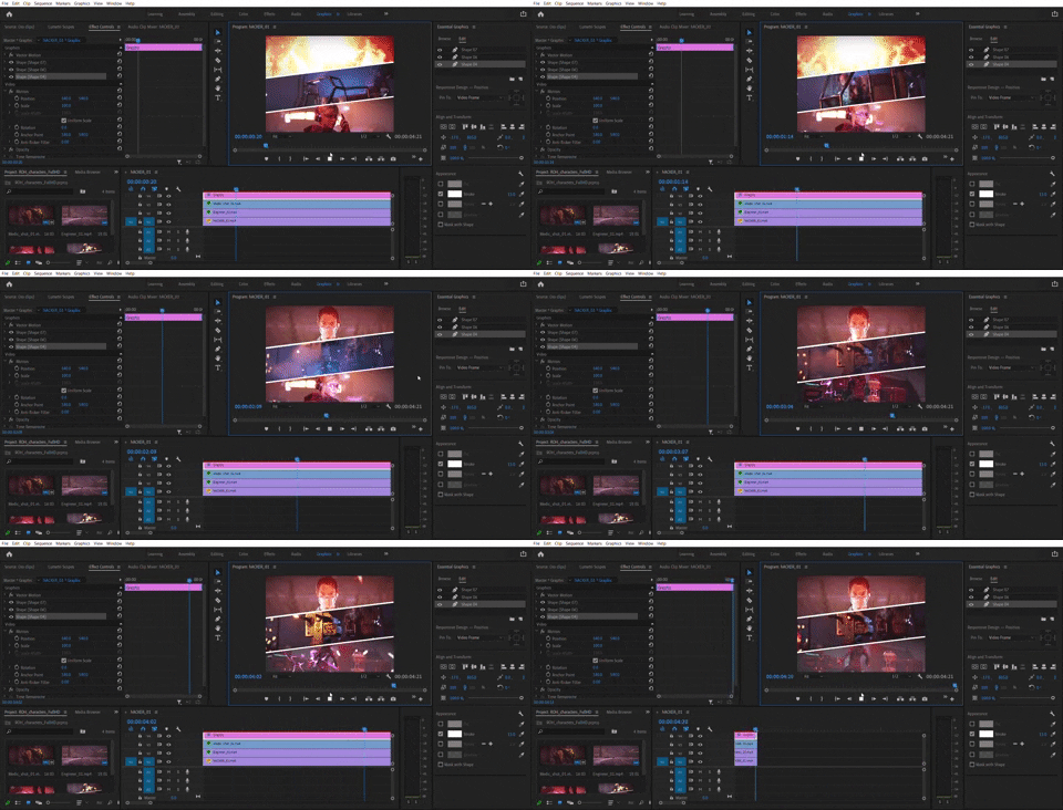
6. Make a mock-up/first draft that you can test. Show this to your team but also to your family and friends who have never played your game and ask them what they think. How interesting was the trailer? Did they want to keep watching? Did they understand the story? Big production houses do this too, only they can afford to test their trailers with focus groups. Us indie developers may have to rely on our trusted relatives and friend circle for this, but still, it’s always best to get some outside opinion from people that haven’t been involved in the creation process in any way. You might get some feedback that makes you want to rethink some things or reorder some scenes.
Be prepared to receive negative or non-usable feedback too. Your friends will probably be very critical (the honest ones at least), while your mom will probably say something like ”Oh that’s yeah very nice, sweety.”
7. Add an end card. This one is very important! Settle on one key message you want to convey. Decide what you want to achieve, which can depend on a lot of things. In an ideal world, we would all have the time and the money to create three different trailers for three key occasions:
- Announcing the existence of your game. In this case, you might want to keep your launch date for a later occasion, and go with a vague ‘COMING SOON’/’WISHLIST NOW’ in your end card. Don’t use all your ammo at once!
- Announcing the release date of your game. Using your trailer to accompany your press release with your launch date is probably one of the best uses of your trailer. Game marketing experts seem to agree that gaming media seems the most interested in news concerning release date, so when it comes to press, this occasion is even more important than your actual launch day. In this case, your end card should obviously contain the two most crucial pieces of information: the name of your game and the release date. Include a call to action as well (WISHLIST NOW) but make sure not to shove too many titles into your end card.
- Your actual launch date. As established earlier, your upcoming release date is more valuable information to the press than your ‘’Hey guys, it’s out now’’ reminder. But! This is the moment when people can actually buy your game and you start seeing the result of all your hard work. Having a trailer to let them know it’s OUT NOW and available to download could be a great asset to increase your sales in the first week of your launch.
One more thing, company logos are important, but not if they take away attention from your game’s title and your key message! Unless you’re a big ass gamedev with AAA titles, placing your company logo in the bottom corner of your end card is perfectly fine. The same goes for the logo of your publisher / financer / maecenas / whatever… You get the point.
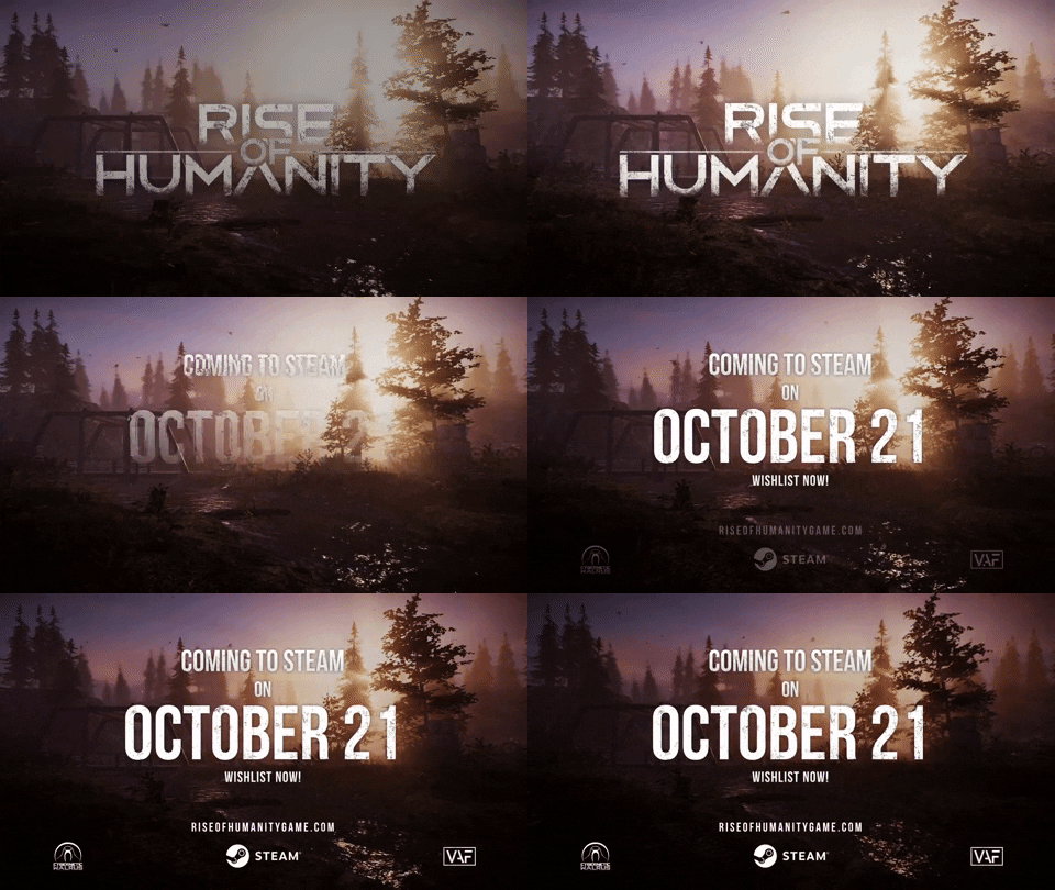
The end card from our game’s trailer, for example

